BYUI Teaching Presentation
Lesson 4 - Navigation - CIT230-11
Professor Jason B. Blazzard
Presented By: Olan Hodges
PowerPoint Presentation DownloadHello everyone! My name is Olan Hodges and I am a student in the BYUI CIT 230 11 Fall 2015 class being directed by Professor Jason B. Blazzard. As part of this short presentation, I will be going over the topic of website navigation. What is navigation, why is it important, and how can we succeed in creating clear, concise, and consistent navigation for our websites now and in the future.
What is Navigation?
So, what is navigation? According to our class book "HTML & CSS" by Jon Duckett on page 471 it states,
Site navigation not only helps people find where they want to go, but also helps them understand what your site is about and how it is organized. Good navigation tends to follow these principles
- Concise
- Clear
- Selective
- Context
- Interactive
- Consistent
Basically, navigation is our website's GPS. It gives a user quick access to all of the different parts of our website and helps them find what they are looking for. Navigation can be split into two different categories: header and footer. Header navigation is at the top of the website, while footer is located at the bottom. Header navigation is mostly what we will be discussing in this lesson. Now let's go further into each of these different descriptions Duckett used to describe successful website navigation.
Concise navigation allows for our "scanning" users to quickly find a high level category for what they are searching for. These should be part of your primary navigation menu and should be kept to no more than eight categories in total. Some sites might require many more links than this, but one idea you can use is to link to the category page where other links can be presented on a secondary navigation panel, allowing the users to see more selections under this category.
Clear navigation goes hand in hand with concise navigation. Not only should you have few categories to select from, but they should be clear to indicate what the user will find when they click your link. Just like the title of another one of our books for class by Steve Krug states, "Don't make me think!" Making a user have to think to get what they need drains them of their energy and can make their experience on your site less than desirable.
Selective navigation means that we should select only categories that actually pertain to our site. By adding login links or help links to the main navigation pane can clutter this environment and make it harder to understand for the end user.
Context based navigation should tell the user clearly where they are in your website. Just like any good GPS, it will put a miniature car on the map where you are at. So should your website indicate to your user where they are in your webpage.
Interactive navigation allows the user to easily see that it is a "clickable" item on your web page, and it should not be difficult to click either. Size, color, and location are all key to making your navigation interactive. You can also make it where the link will change color when the user hovers over the link to indicate to the user which link they are selecting and that it is an actionable item.
Consistency is crucial to usability. If you are making your user relearn how to use your site on every single page, it will quickly drain your user's emotional "batteries" and even force them to change websites to find the information or product they are looking for.
Example Header Navigation - DallasStars.com

The first example we have is from the best hockey team in the nation, the Dallas Stars. Let's go down the list of the six topics that Duckett mentioned makes a successful navigation panel.
First, is it concise? Each of the ten categories is clearly different from the other and does not leave any ambiguity as to which section you want to click on. If you want tickets, there is a link for that. What were Jamie Benn's stats from last night's game? There's a link for that. Where can I go to get the coolest hockey apparel around? They have a link for that! So I think they have a check on the concise category.
Second, is it clear? Each of the categories is clear as to what sub-items are contained inside of it. The only section that I find odd is the "Fan Zone" as there is quite a range of different items in this page, ranging from the team Mascot to promotion nights throughout the season. It definitely all deals with fans both big and small, but some people have problem with that section. I would still say they are clear in their categorization.
Third, is it selective? I feel they have done very well in making their navigation selective. The only part that does not follow the description Duckett mentions is the search bar. That should be placed somewhere else, rather than in the navigation bar, making it look more cluttered and less consistent.
Fourth, is it context based? This I believe they have failed on. Each site only mentions the current subpage you are on from the navigation menus, but it does not let you know what the main navigation category is for the page you are on. They could fix this by keeping the "on hover" color selected for the navigation category you are at currently.
Fifth, is it interactive? For each link you hover over, not only does it change color, but it brings up a submenu for a more granular selection of what you want to look at on their website.
And sixth, is it consistent? Almost every page you visit on the Dallas Stars web site has the same navigation bar, in the same location, with the same colors and text. It makes it for an easy anchor point for you to return to if you feel you have not found what you need or want to go some where else.
Example Header Navigation - Lowes.com

Let's look at one more example and see what we can learn from them. Another place that I spend quite a few weekends and nights at is Lowe's. Their navigation is concise as they only have four categories in which they have segmented their site. It's clear because it does not have extraneous links to subjects which do not pertain to their mission to provide home improvement to all individuals. It is also selective as they have only included four categories for their main navigation, even though their stores are comprised of hundreds of different categories of items that they sell. They have made good use of primary and secondary navigation panes and have worked hard on making sure their secondary navigation is also clear and selective.

They are context based, as it will leave what is called a breadcrumb trail for you to know where you are, and what category each item is under. And this navigation does not change, no matter what portion of the site you visit. It is very consistent and user friendly. The only oddity is the search bar that is located in the navigation bar, which clutters up that area making it slightly harder for you to understand what is going on.
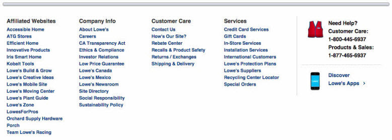
Example Footer Navigation - Lowes.com

Footer navigation is usually used for lesser used, but still common navigation links such as the contact us, legalese, and store location sites. These are just as important for users, but can easily be put at the bottom of the page. Above is an example of footer navigation for Lowes.com. This follows many of the same rules as the header, but is more flexible on the quantity of links and compactness due to it's location at the bottom of every page. But consistency, conciseness, clarity, and interactivity are still key to success with this navigation panel.
Code Example - W3Schools.com

Now that we know how to build navigation from a conceptual design, what does a navigation bar look like from an HTML code perspective? This can change from site to site based on their CSS and HTML design. But beneath the covers, website navigation is just a collection of anchor statements linking to different sections of your website. In this example, the navigation has been made as an unordered list with four separate list items; Home, news, contact, and about. We have already been working on the concepts for our navigation by working on our site map for our site plan document. From that site map, we can build the category pages and sub pages for each page and create the navigation panel that will allow our users to find what they need quickly and easily on our sites.
Summary
- Make navigation a joy to use for your users
- We scan for information; make it easy for them to find
- Happy users = excellent website flow and clear concise information
- Frustrated users = poorly designed and thought out site
To summarize, navigation should help our users, not deter them. We should make it easy for the user to understand where that item or information is that they are looking for without having to go through a search of our website content. We should also make sure the user can easily interact with our navigation. Make sure the user knows what is "clickable" and clearly indicate to them that their cursor is on the desired link by color change or other interactive method. If we are successful in our design and planning, we will have happy users, who in turn will visit our website again and recommend it to others.
