Design Principles
Proximity
Mark Gallup
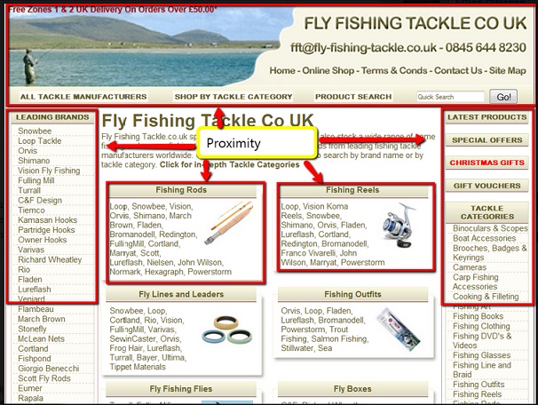
The principle of proximity says that related items need to be grouped visually, creating less clutter and making for a more organized layout. Items unrelated to each other should be placed further apart, to emphasize their lack of relationship. The Proximity here on the Fly Fishing Tackle UK site is very good as all the elements that relate to each other are grouped together. There is no odd spacing and all the space on the site is used very well.
Alignment
Lance Tidwell
Alignment encompasses a group of attributes.
- Placement
- Position
- Orientation
- Grouping of Elements
I really liked this definition from the assignment.
Alignment as an effective web design principle allows us to make conscious decisions about how and where elements are placed on the page. Taking advantage of strategic placement helps us to craft stronger and more compelling compositions and utilizing a grid system provides a standard guide for element placement. Without an alignment strategy we would end up with arbitrarily placed elements, with little or no connection to additional or similar features. Without alignment, the look and feel of your website would be a haphazard assortment of open-ended disorder.
Boudreaux, Ryan. "Effective Design Principles for Web Designers: Alignment." 22 Aug. 2012. Web. 8 Oct. 2015.
Alignment is the backbone of your web design. It develops order and order conveys harmony. There is a lot of information on alignment. I recommend reviewing the website listed in the citation above.
For the technical stuff on alignment:
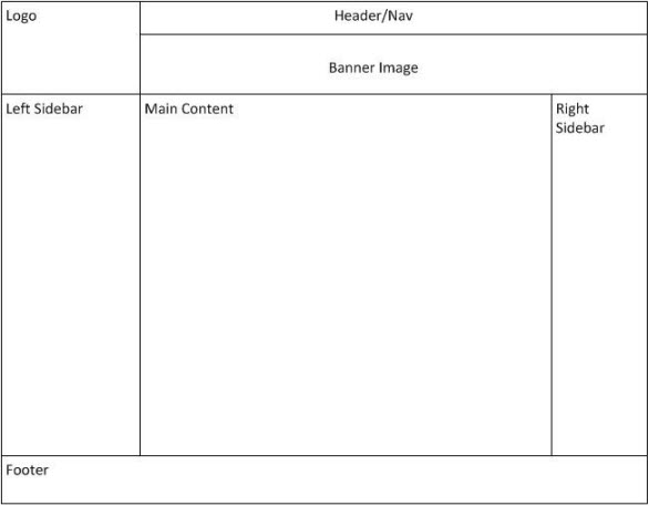
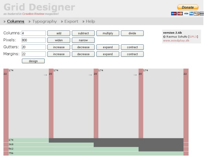
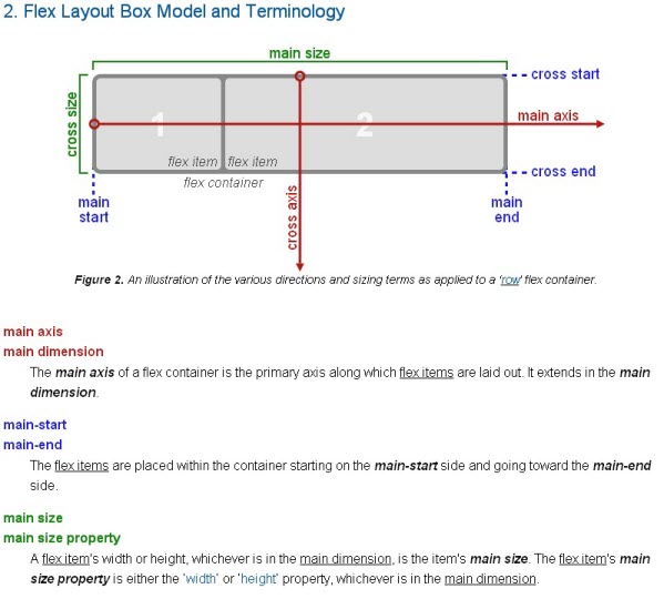
According to one of our texts for this class Alignment has been removed from HTML5 and we should use CSS to control alignment. I am including some images from the website to help you picture what alignment is all about.
Repetition
Celeste Lafollette
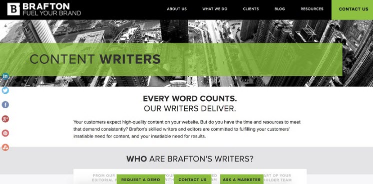
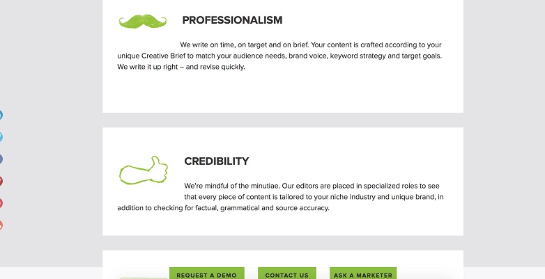
This website demonstrates the design principle of repetition. The distinctive green color is repeated in several places, just enough to bring visual consistency without being redundant. It is used in a box to highlight Content Writers, the subject of the entire site. It is also used in Contact Us. Three green boxes are repeated at the bottom of each page also for Request a Demo, Contact Us, and Ask a Marketer. The graphics are repeated in similar size, style, and color as well. Each graphic has a sketched, or hand-drawn quality to it. Bold lettering is repeated in several headings to draw attention to those words and bring consistency to the design of the page. The same font size and typeface is repeated for all the headings. This website’s use of repetition is subtle yet balanced in bringing unity to the overall design of each page.
Contrast
Hannah Mars
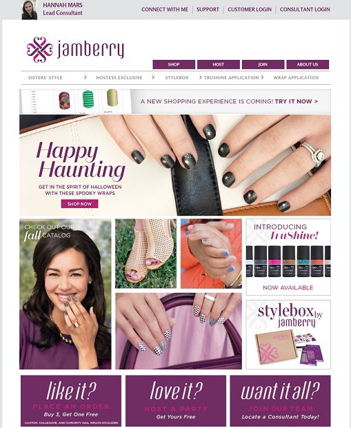
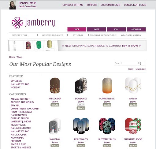
Jamberry's website uses it's logo color Plum as it's base and primary color as well as 2 tinted versions of plum for accents. Navigation tabs and other important links are displayed in the base color which stand out against the light gray background. When a link is clicked, the link is highlighted in a tinted version of the base color.
Typography
Jeff Bassett
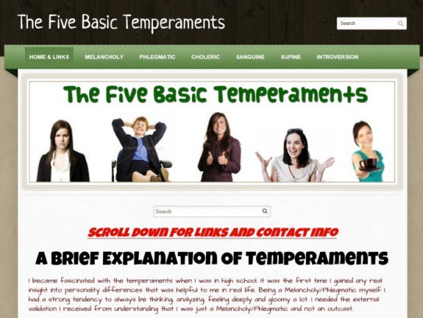
It probably isn't too difficult to see why I chose this page when looking for examples of typography. We were warned in one of the readings that most people have access to fewer fonts than we do, and if we want to be sure our message comes across without out webdings and meaningless characters popping up we should stick to these few fonts:
- Andale Mono
- Arial/Arial Black
- Courier/Courier New
- Georgia
- Impact
- Times / Times New Roman
- Trebuchet MS
- Verdana
There was also a warning about staying away from this particular font to maintain a professional look to our websites:
Comic Sans (this is an unprofessional, many would say ugly font - don't use this, except perhaps sparingly on sites aimed at children)
My site will be aimed partially at children so I might try Comic Sans just once. I really searched for a site that used sweeping, artistic typography but found, as we were told, most sites do virtually nothing with typography except to vary size, color, and page placement. The majority seem to carry the "less is more" model and do look very professional. This site was especially into color and variation. There are font variations, color variations, size, and font weight variations.
The business portions: the title, the navigation bar, and the green ad box offering, and the title to the text were all clear and well defined.
The overall effect was inviting - my curiosity was stirred and my eyes were pleased to see things easily and clearly. Having jubilant models added to the message of the cheery type. Near the bottom of the page was a little design art with more clear and openly spaced typography. Enjoyed it!
Team Members
- Mark Gallup - Proximity
- Lance Tidwell - Alignment
- Celeste Lafollette - Repetition
- Hannah Mars - Contrast
- Jeff Bassett - Typography
